Skip links

JYN Branding and Logo Design

Branding a Growing Organization

JYN supports a growing range of programs and experiences that help Jewish youth connect, grow, and feel a real sense of belonging within their community.
As the organization continued to expand, its visual identity needed to keep pace. What once worked could no longer fully reflect the scale of the work, the energy of its youth, or the confidence of an organization building toward the future.

Client

Jewish Youth Network

Project

Branding and Logo Design

This project marked an important moment for JYN. Our goal was to create a clear visual language that could bring programs, spaces, and platforms together, while feeling approachable, modern, and deeply rooted in Jewish purpose

We developed a comprehensive visual identity designed to work as one cohesive system, making it easier for JYN to show up clearly and confidently across every touchpoint

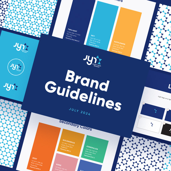
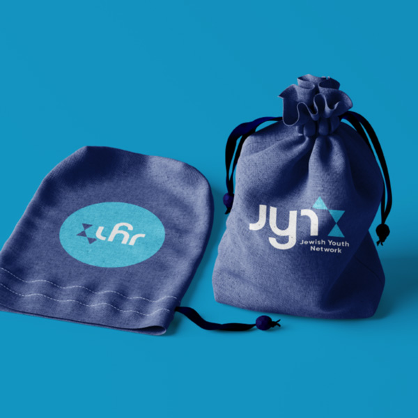
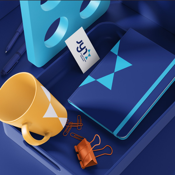
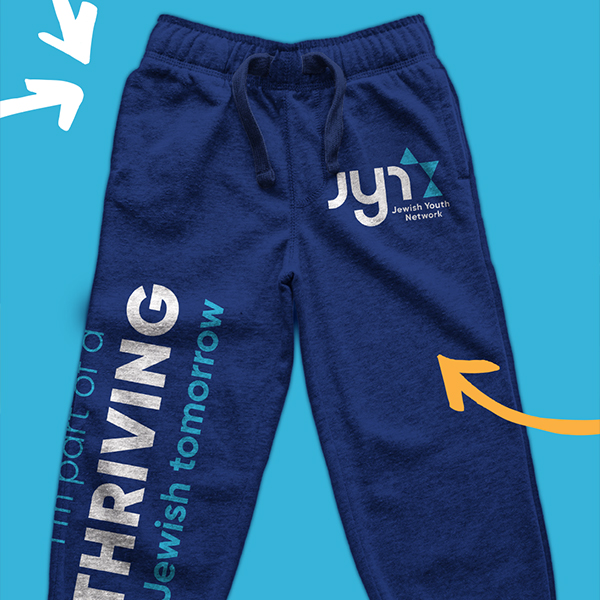
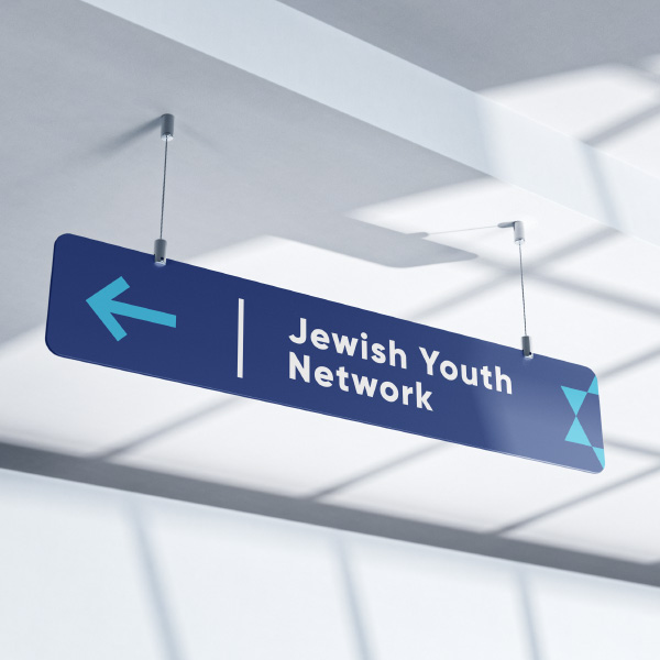
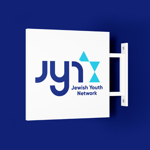
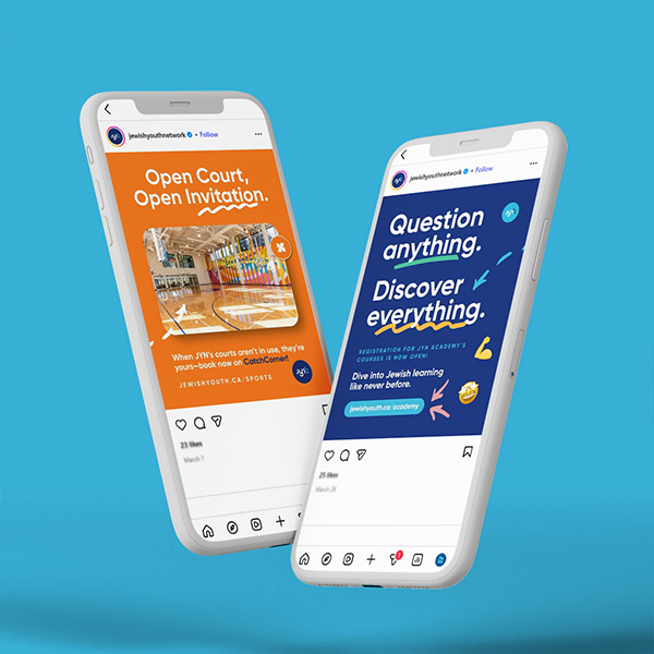
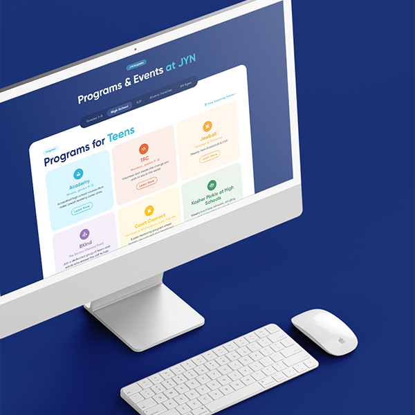
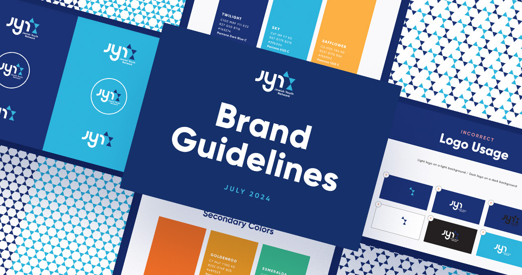
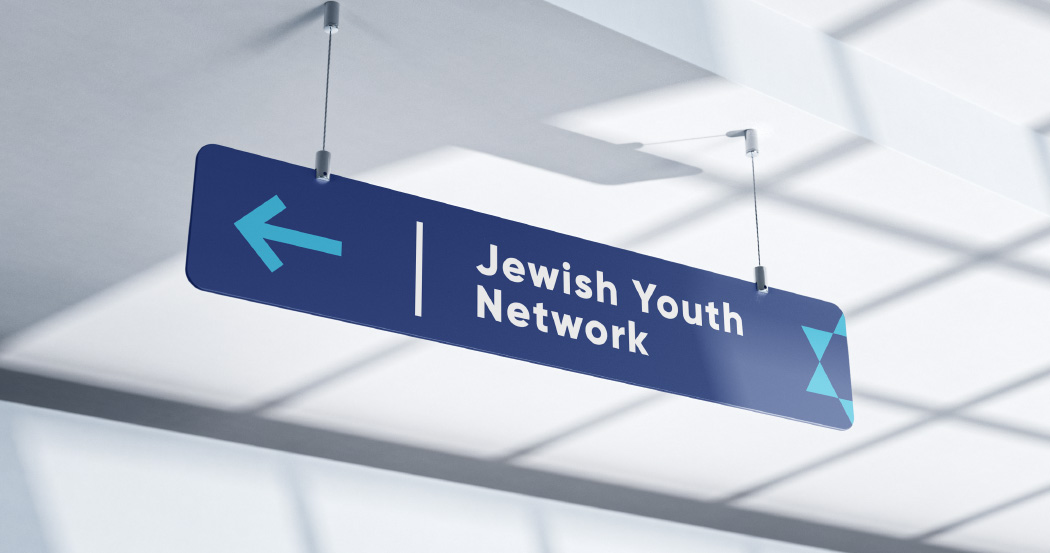
The modular logo system, vibrant yet balanced color palette, and modern typography were built to work seamlessly across digital platforms, print materials, apparel, signage, and physical environments. Clear usage guidelines keep everything aligned as the organization continues to grow.

The Results

The completed branding gave JYN a unified, recognizable presence across its entire organization. What had previously existed as disconnected pieces came together as a cohesive visual system that supports daily programming, major initiatives, and future growth.

With a strong brand foundation in place, JYN now shows up with greater confidence and consistency across environments. The result is not simply a new look, but a brand system built to support momentum as the organization continues to expand.